Color theory is not an aesthetic. This page is a tool to provide terminology and guidance related the use of color in aesthetics.
The color theory is a concept to help guide one in the use of color and has terminology that helps the person understand how colors work together. There are three parts of color: saturation (how bright the color is, or how much pigment is used), value (how dark or light the color is, colloquially referred to as shade), and hue (the color or wavelength of light you are seeing).[1] As the color wheel focuses on hue that is what will be the next subject.
The color wheel[]
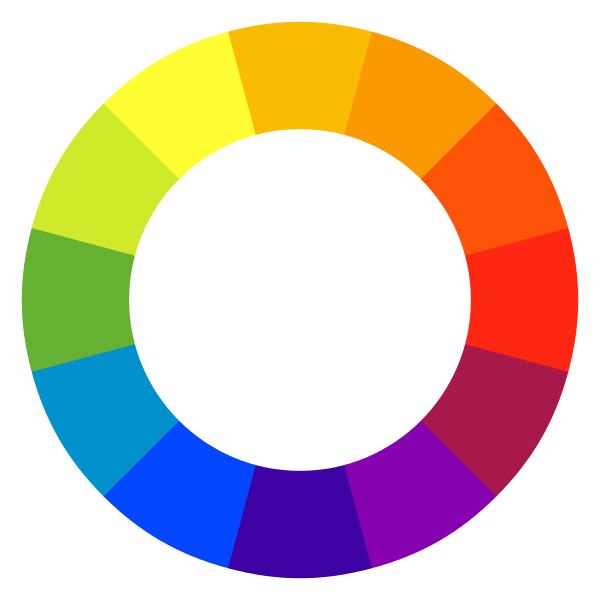
A color wheel using the traditional primary RYB color model.
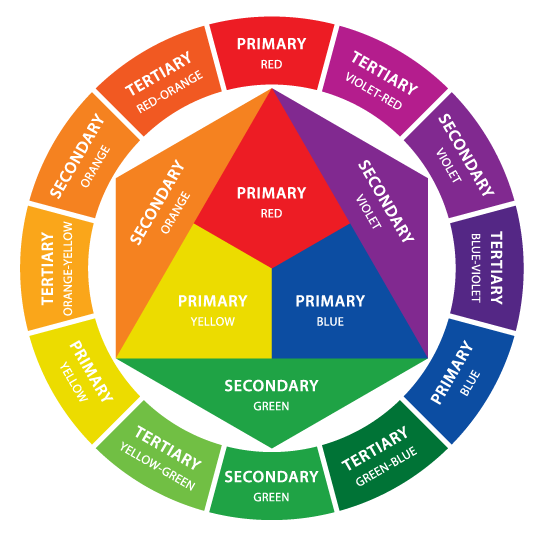
An RYB color wheel with primary, secondary, and tertiary colors labeled.
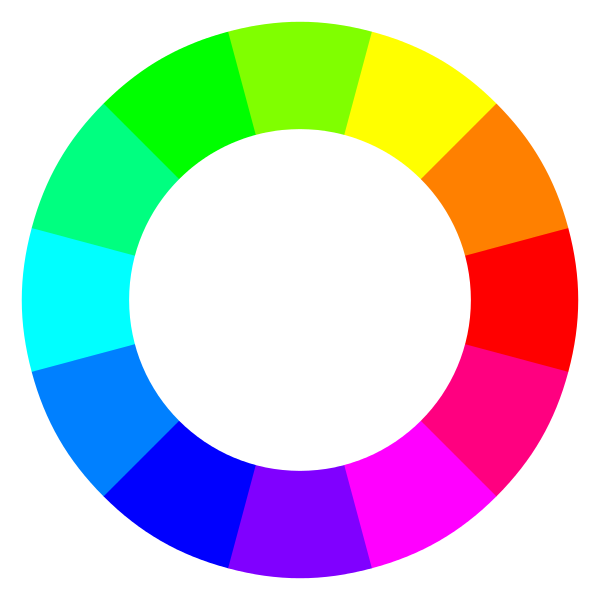
A color wheel using the modern RGB/CMYK color model.
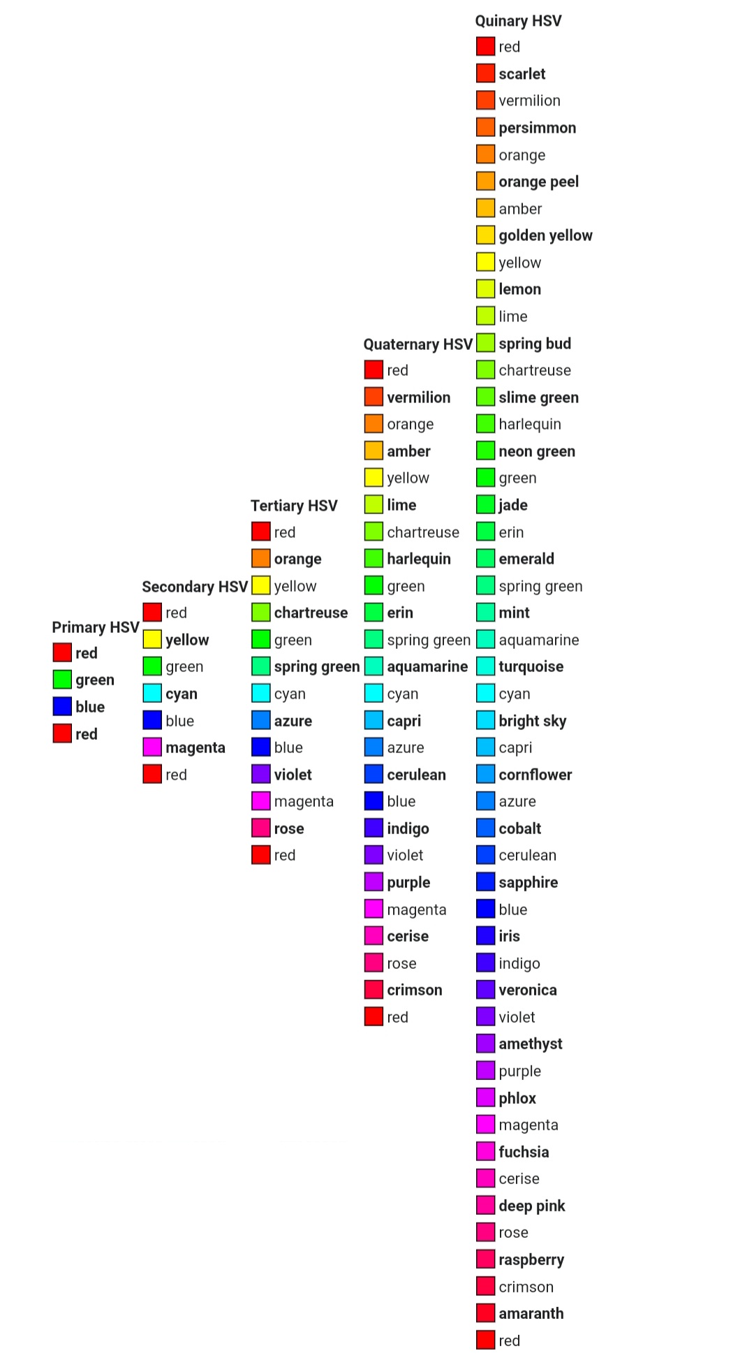
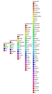
A list of colors from primary to quinary using the modern RGB/CMYK color model.
The color wheel is a popular, abstract, illustrative organization of color hues in the shape of a circle, used to demonstrate the relationships between primary, secondary, and tertiary colors, and sometimes more (including further combinations of color or gradients).
Primary colors[]
A set of primary colors are a set of colors that can be combined to produce a gamut of color. The color wheel typically has three primary colors, based on either the RGB (red, green, and blue) color model or the RYB (red, yellow, and blue) color model. The RYB model is used mostly in non-digital art and applied design, and the RGB model is used mostly for color display in electronic systems. Because both online and offline visuals are relevant to aesthetics, information about both models of color will be included here.
Secondary colors[]
Secondary colors are colors created through the combination of two primary colors.
In the RYB color model, these are orange, green, and purple. In the RGB model, they are yellow, magenta, and cyan.
Tertiary colors[]
Tertiary colors are color created through the combination of a primary color and a secondary color, or a combination of two secondary colors.
According to the RYB color model, these are vermilion, amber, chartreuse, teal, violet, and magenta. In the RGB model, they are azure, violet, rose, orange, chartreuse, and spring green.
Warm vs. cool colors[]
The precise division between warm and cool colors is disputed. However, red, orange, yellow are most commonly considered warm, while green, blue, and violet are cool. See Color symbolism for descriptions of meanings associated with warm and cool colors.
Complementary colors[]
Direct complementary colors[]
Direct complementary colors are colors positioned opposite each other on the color wheel, or 180 degrees, which create neutral colors when mixed. On the RYB colour wheel, they are red-green, blue-orange, and yellow-purple. On the RGB color wheel, they are red-cyan, blue-yellow, and green-magenta.
These colours contrast with each other, which, at full saturation, like in Slimepunk, can cause eye strain.
When placed against each other, complementary colors often look discordant.
Split complementary colours[]
Split complementary colors are sets of three colors including one color and two colors adjacent to that color’s direct complement, which are 150 degrees from the original color. Like complementary colors, they contrast with each other significantly. This creates a sense of unity and energy (but is more complicated than either complementary or analogous). Mythpunk uses one of these.
Triadic colors[]
Triads are sets of three colours at equal distance from each other on the colour wheel, which are 120 degrees from the original color. These are usually red, blue, and yellow or green, orange, and purple like on Halloween. The Art Hoe aesthetic uses a mainly triad based colour scheme.
Tetradic colors[]
Tetrads are sets of four colors at equal distance from each other from the color wheel, all of which are 90 degrees from each other. An example would be red, cyan, chartreuse, and violet.
Near-analogous colors[]
Near-analogous colors are sets of colors positioned almost directly close to the original color of choice, which are 60 degrees away from each other. An example would be red, yellow, and magenta.
Analogous colors[]
Analogous colours are sets of colors positioned beside each other on the colour wheel, i.e. red, red-orange, and orange. These colors are harmonious, creating a sense of unity. However, it can also seem more artificial if done improperly or have no focal point in an image. Examples of aesthetics that frequently use analogous colour palettes include Light Academia, Red, or Traumacore, or Yami Kawaii.
Saturation[]

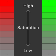
High saturation means brighter colours, and lower saturation means duller colours.
Saturation describes proximity of a color to gray and its relative intensity and brilliance. As saturation increases, intensity and brilliance increase; as saturation decreases, proximity to gray increases. This can make something appear light or dark, but it doesn't mean it is (for that, see value). Saturation can be effective for drawing attention to a focal point, but if an image is highly saturated all over, it can cause visual illusions, headaches, and a sense of chaos in the viewer. Desaturated (low saturation) colours are easier to unify but they are also less of a focal point and are more likely to seem tired or old.
Saturated colors[]
Fluorescent colors[]
Fluorescent colors, also known as neon colors, can cause a sense of chaos, disquiet, discomfort, and, in some cases, visual illusions and eye strain. Aesthetics that use this are Psychedelica. Neon colors are often used separately from one another in aesthetics, such as separating Scene from Emo. Neon colors are used in Cyberpunk and Vaporwave to prevent too much discomfort, but also to imitate neon lighting and other artificial light sources.
Bright colors[]
Bright colours are colours with high saturation of any hue. These often seem childish and can be hard to style together. However, they are also bold and create a statement either independently or in a group. These are often associated with the '70s, '80s, and early 90s' - 2000s fashion. Nostalgiacore, Art Hoe, and Wormcore all use bright colors.
Desaturated colors[]
Earth Tones[]
Earth tones are low-saturation colours of any value that can be found frequently in nature. These colours commonly include browns, yellows, greys, greens, and blues. They can symbolize life and nature generally, as in Naturecore, adventuring, as in Adventurecore, and nature as in Art Nouveau.
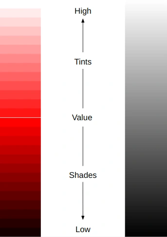
Value scale
Value[]
Value describes the amount of white or black in a color and its relative lightness or darkness. A hue to which white has been added is a tint, and a hue to which black has been added is a shade.
Darker values are usually considered more serious, though not necessarily masculine. The femme fatale aesthetic often uses shades, though it is also highly feminine. However, tints are often associated with purity (just as white is) and femininity.
Color Types[]
Muted tones: Muted tones are desaturated colours with a low value. Muted tones give the appearance of age and officiality, as in Dark Academia or Dolly Kei and to fit a certain era's photos aesthetic such as in Cryptidcore. They can also seem dull and lifeless such as in Ocean Grunge.
Pastels: Pastel colors, or pastels, are colors with high value and low saturation. Pastels colors include baby blue, pink, mint, lavender, and lilac. They’re sometimes used in bright aesthetics derived from dark aesthetics, as in Bubble Goth, Pastel Goth, and Pastel Punk. They are also used to symbolize femininity, as in Lolita and Mori Kei, sweetness and happiness, in Cottagecore and Light Academia, or innocence and purity, as in Angelcore and Fairycore.
Grayscale: Grayscale color schemes are sets of colors between white and black.
Monochromatic: Monochromatic color schemes are sets of colors with the same hue but varying values.
High contrast: While most colour palettes with contrasting colors rely on those colors having the same value. A high contrast palette is a limited colour scheme that relies on the contrast of black, dark greys and white to achieve its effect. Many goth aesthetics and Vampire use high contrast palettes.
Some of these colour palettes do not fall into the other three categories. They usually have another unifying factor or could still technically fit into one of the other categories, even though that's not why they were put together in the first place.
Jewel tones: Jewel tones were originally based off of crystals and precious stones. These are predominantly dark to medium shades of purple, cyan, emerald green, yellow, or red. Jewel tones are often popular during autumn (in America and the West) so it's no surprise it's in Autumn.
Metallic colours: Metallic colours are inspired by metals. These are silver, like in Y2K, gold, like in Wabi-Sabi, bronze, chrome, steel, or copper. Other aesthetics that use metallic colors are Crowcore and Cyberprep. Holosexual arguably uses some metallic colors, too.
Cool colours: Cool colours are either cool-toned colours (like Crimson red, ultramarine blue,) and therefore make a different feeling colour wheel than warm-toned and will make better purples and blacks when painting, or they are colours associated with winter or water. Two examples are Seapunk and Icepunk.
Warm colours: Warm colours are either colours that are warm toned (in this case Cadmium red, Cerulean blue, and Cadmium yellow) and will make better oranges, or are colours associated with warmth, summer, or food. Warmcore, Tropical, and Golden Hour are all examples of aesthetics with warm colours.
Finding your aesthetic's color palette[]
Of course, this begs the question, "Does an aesthetic need a colour scheme or palette?" The short answer is not always. Neither Cleancore nor Goblincore have one listed at this time (04/08/2020). A colour scheme is a great unifying tool but it sometimes becomes too restrictive. However, it does allow a lot more people to see and identify your aesthetic visually. A colour palette or scheme can also serve a vital function of defining your aesthetic and its message from another aesthetic, as well as creating nuanced meaning to your aesthetic, such as in things such as Vaporwave.
How do I create a colour palette? This article will now take you through three methods of choosing your colour palette using an example: Mythpunk.
Decide what your colour scheme needs to do: is it separating your punk from another aesthetic like Seapunk? Is it just something to make everything cohesive? Or is it adding onto a meaning or symbolism, or changing the meaning? Pastels with children’s toys would enforce the meaning, but deep blue would change the image. Colours can change the meaning or look of something very quickly. If you want to use the colour scheme to create a difference between your aesthetic and another one, see what the first aesthetics colour scheme is, then go for the opposite.
- For example, if you took Angelcore but wanted to make a similar aesthetic surrounding a darker version of angels (let's call it Mythpunk) you would look at Angelcore’s colour scheme and go for the opposite. Angelcore has pastels, so Mythpunk needs more shades.
Look through this list, see the aesthetics you’re inspired by and go off of them. See what you would like to keep or throw away.
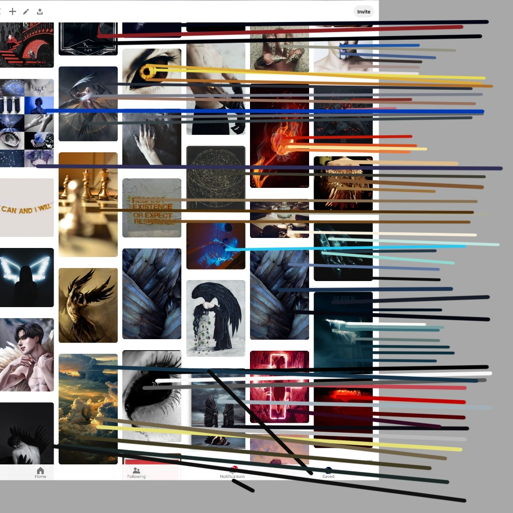
Colour picking off of my Pinterest board, to narrow down my colour options.
Photo picking[]
Photo picking means taking one or more images and taking the eyedropper tool, and seeing what colours are contained in them. You take bits from all the pictures, not just the focal point. The example to the right, there's a lot of low-value colours, quite a few dark browns, but definite pops of gold, blue, aqua, and red-orange.
You can also just eyeball it, but using the eyedropper tool will give you the most unbiased results.
I did this for my Mythpunk and got several options: as you can see to the left. Blues, aqua, black, brown, red, orange, etc.
Creating a new colour scheme: with this, you need to take the fundamental principals from the colour wheel, Saturation, and Value. Take those concepts and use them to either polish up your colour palette or to find your ideal colours.
- To use Mythpunk again, I still had too many colours around. So, I decided to go for a split complementary (red-orange, and yellow + blue). I still wanted to keep darker shades, but this allowed me the high contrast pops of colour I needed to fit the images I had.
Try to have fun with it.